Trading Update: Monday October 16, 2023
S&P Emini pre-open market analysis
Emini daily chart
- The Emini pulled back over the past two trading days after last week’s strong rally.
- The bulls are hopeful that today will form a High 1 Buy Signal
- The odds favor a second leg up after the rally that began on October 6th. However, the pullback last Thursday and Friday is a warning that the market is in a trading range.
- The bears who sold the September 29th high and scaled in higher made money. Which is a sign that the market is in a trading range.
- Overall, traders should expect a second leg up.
Emini 5-minute chart and what to expect today
- Emini is up 20 points in the overnight Globex session.
- The overnight Globex market formed a second leg up after a pullback during the overnight hours.
- There is an 80% chance that today will become a trading range open and only a 20% chance of a trend from the open.
- Most traders should wait 6-12 bars before placing a trade unless they are comfortable with limit orders and making quick decisions.
- Most traders should try and catch the opening swing that often begins before the end of the second hour.
- It is common for the market to form the opening swing after the formation of a double top/bottom or a wedge top/bottom.
- Traders should pay attention to yesterday’s high and the open of the day.
Emini intraday market update
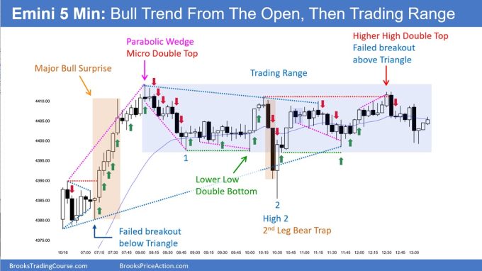
- The Emini gapped up and formed a triangle before breaking out to the upside.
- At bar 21, the market formed a parabolic wedge top and formed a two-legged pullback down to the moving average (bar 27).
- The channel down is tight enough that the bears want a second leg down.
- The bulls see the rally up to the high of the day as being strong enough for a second leg up.
- As of bar 42, the market is in breakout mode; on bar 42, it failed to break out to the downside. It is reasonable to expect a test up to the high of the day.
- Even if the bulls get a rally to the high of the day, the odds will favor a trading range and a successful breakout to the upside.
Friday’s Emini setups

Al created the SP500 Emini charts.
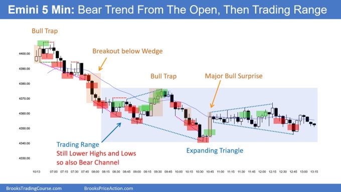
Here are reasonable stop entry setups from Friday. I show each buy entry with a green rectangle and each sell entry with a red rectangle. Buyers of both the Brooks Trading Course and Encyclopedia of Chart Patterns have access to a near 4-year library of more detailed explanations of swing trade setups (see Online Course/BTC Daily Setups). Encyclopedia members get current daily charts added to Encyclopedia.
My goal with these charts is to present an Always In perspective. If a trader was trying to be Always In or nearly Always In a position all day, and he was not currently in the market, these entries would be logical times for him to enter. These therefore are swing entries.
It is important to understand that most swing setups do not lead to swing trades. As soon as traders are disappointed, many exit. Those who exit prefer to get out with a small profit (scalp), but often have to exit with a small loss.
If the risk is too big for your account, you should wait for trades with less risk or trade an alternative market like the Micro Emini.
EURUSD Forex market trading strategies
EURUSD Forex daily chart

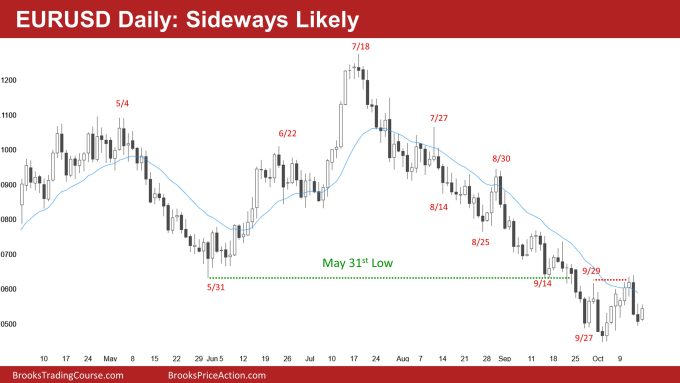
- The EURUSD sold off last Thursday and Friday, testing near the October lows.
- While the bears are hopeful that last Thursday’s bear breakout will lead to lower prices, more likely, the selloff is part of a trading range.
- Today, the bulls are trying to disappoint the bears and will likely succeed.
- Even if today is a bull bar closing on its high, there will probably be sellers above for at least a brief attempt at a second leg down.
Summary of today’s S&P Emini price action

Al created the SP500 Emini charts.
End of day video review
See the weekly update for a discussion of the price action on the weekly chart and for what to expect going into next week.
Trading Room
Al Brooks and other presenters talk about the detailed Emini price action real-time each day in the BrooksPriceAction.com trading room days. We offer a 2 day free trial.
Charts use Pacific Time
When times are mentioned, it is USA Pacific Time. The Emini day session charts begin at 6:30 am PT and end at 1:15 pm PT which is 15 minutes after the NYSE closes. You can read background information on the market reports on the Market Update page.


The boxes may have been centered on the entry bar but they also overlapped the signal bar showing exactly where the stop order should be placed.
Good morning, Dr. Brooks. Thanks for everything you do.
I fully admit I find the entry bar arrows harder to parse than the signal bar boxes (and I have the same issue with my platform, which indicates executed orders similarly–making the sequence on always-in reversals ambiguous, for example).
The boxes have their own graphic design problems I sympathize with wanting to amend, but they have a good visual quality of indicating the verticality of price action–closely resembling how several platforms allow traders to place orders directly on the chart. I visualize price action as the market orders “eating” limit orders, so a stop order has an intentional, predatory location.
My personal recommendation would be to design an arrow that goes in place of the boxes.
Example 1: a horizontal line segment attached to one or more arrows (or triangles, or detached carets) pointing in the direction of the trade,
Example 2: an arrow pointing rightward.
I feel either one would alleviate some of the problems with boxes without fundamentally changing what was working with them. I’m more fond of 1, despite it being more elaborate; it’s more colorblindness-friendly, just like the entry bar arrows are.
(For the sake of having a third example, I will mention an option I do not recommend, but some traders may find useful–I mark my own chart with the risk-reward tool in my platform. It gives me specific prices for TP orders with little effort on my part, but it is pure visual clutter. I use boxes to mark gaps.)
Colored arrows are great. The chart is much cleaner and easier to read. The boxes aren’t overlapping and the bars are actually visible. Pointing to the entry bar makes sense as well. I think this is more appropriate for a traders point of view. Good idea.
Would you please consider keeping the green and red boxes? The arrows are confusing imo. What is important for us as students, is to identify the signal bars and not the entry bars. The boxes gave a clear indication of the signal bar. With the arrows, it’s now the double work to go through the chart. First we need to identify the arrow/entry bar and then look to the left to see the signal bar.
Same. It makes it a little bit harder to find signal bars and exact entry price with stop orders.
Hi Mikael,
The boxes were positioned on the entry bars too so you still had to look left to see the signal bar. So no real difference other than having to visualize where the actual entry would be (ie 1 tick above signal bar).
I suggest you give it a little time and you can then hopefully appreciate seeing the bars without the boxes overlaying them.
Not double work at all. As said, you still had to look to left. With multiple entries the bars then get lost behind overlapping boxes as Andreas notes above.
I also agree with Mikael and Koki. If keep arrows, would prefer over signal bars…maybe adding red arrow for shorts, green arrows for longs.
I feel the same Jeremy. Don’t mind the arrows at all. That’s the way I do my own chart during the day for record keeping with signal bars where I take my own trades but like the custom of keeping the arrow over the signal bars. That’s the way the boxes were done in the past.
Exact place of entry is visually more accurate with the boxes. The arrows now hover above or below the exact entry place. I also never had issues with seeing the bars properly.
Hi admin, thx for the reply. I think, it’s fair to say that the boxes at least overlapped the signal bar. Anyhow the boxes were positioned in a way that gave you a quick and clear mark of, where the entry point is. With the arrows, you need to look away from the entry point – sometimes far above or beneath the entry point. So I will still argue, it’s more work to read.