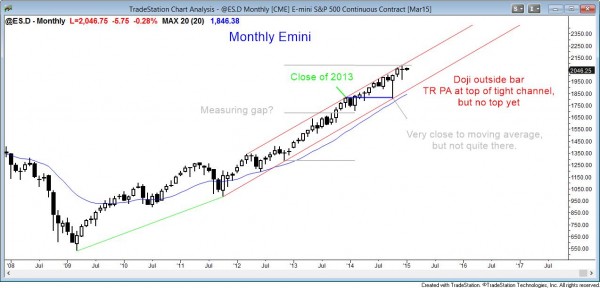
Monthly S&P500 Emini candle chart: Buy climax on the monthly candle chart, but no top yet
Last month’s candle in the Emini was an outside bar, but it was only a doji instead of a strong bull trend bar. The Emini is in a strong bull trend. It is overbought and at the top of the channel, but there is no sign of a top.
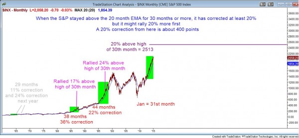
This is the monthly chart of the cash index going back 50 years. The current rally has been above the moving average for 31 months, including the current month. This has only happened twice in the past 50 years. When it happened in 1987, it rallied for another 6 month and another 17%, but then crashed 36%. It happened again on the bull breakout in 1995 when the republicans took control of the House. After the 31st month, it continued up for another 13 months and 24% before reversing down 22%. Unlike that time when the rally was at the start of a bull trend, the current situation is occurring late in a bull trend. This makes a top likely to occur long before 44 months.
The monthly S&P500 Emini candle chart is in a strong bull trend with no sign of a top, but it is very overbought. There are many measures of whether a market is overbought or oversold. I am referring to one in particular that is very easy to test. I simply am counting the number of consecutive months since the low of a bar was below the moving average.
Remember, an average is just that…it is an average price, which means that the market spends time below it, as well as above it. Markets tend to do the same thing over time. These repeating tendencies are due do our genetic makeup, and this is the basis of technical analysis. Until we evolve into a new species, price action will always be the same.
Also, the charts are a reflection of rational human behavior, and it is the same for all markets. People create markets to facilitate trading. A natural byproduct is that markets constantly search for maximum volume. They probe up and down. If the volume disappears, they probe in the opposite direction. If a market goes too far in one direction, in this case, up, trading will stop because there will be no one willing to buy too high. The price will have to fall to a level where buyers again think that there is value in buying.
Are we at that point yet? There is no clear sign of a top, but the Trader’s Equation is interesting at this point. When I look at the past two times when the monthly chart was this overbought, the Emini continued up for about another 20% before reversing down about 20%. Since the odds are probably more than 60% that the Emini will have a 20% correction before it goes up another 20%, the Trader’s Equation tells me that no one should be buying and holding at this point. It makes more mathematical sense to exit long-term positions and wait for a 20% correction before buying.
Does it make more practical sense? It depends on a person’s goals. If an investor is planning on holding for years, it does not make sense to exit at this point because those past 20% corrections were both followed by huge bull trends. Whatever selloff that we get will also be followed by many more huge bull trends. Look at 1929 and 1987. Both had horrible crashes, but anyone who held long made many times their money.
On the other hand, if a person is looking to buy now and they are considering taking profits after a 10 – 20% gain, it makes more mathematical and practical sense to wait for a 20% pullback before buying.
This is the first week of the year and there is a tradition on Wall St. to find significance in what happens early in the year. They also pay attention to other calendar tendencies. Traders like to think of January as a barometer and look for statistics about whether the new year will be an up or down year based on what happens in January. Although the statistics are valid, they do not help in structuring trades.
Here is my list:
The year is up 67% of the time and down 33%.
If the 1st 5 days of January are up, January is up 76% of the time. However, all months are up 65% of the time, so this is only a small improvement.
If the first 5 days are negative, Jan is down 60% of the time, instead of only 35%.
If January is up, the year is up 82% of the time, and the average gain from Feb –Dec is 8.5%.
If January is down, the average gain from Feb –Dec is only 1.7%, and the year has a 58% chance of being down, instead of the usual 33%.
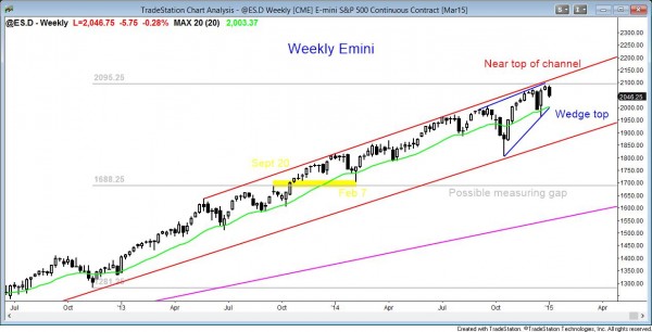
Weekly S&P500 Emini candle chart: Expanding triangle at the top of the channel
The weekly Emini candle chart is turning down from an expanding triangle top and a wedge top at the top of a tight bull channel, but the bears need follow-through to reverse the bull trend.
The weekly S&P500 Emini candle chart is turning down for a second time from its expanding triangle top at the top of the channel. It also has a wedge top, which means that the bears will try for two legs down.
The weekly Emini is still in a strong bull trend. The bears need consecutive strong bear trend bars before traders will think of this selloff as a reversal, instead of just a pullback and another bull flag.
There are still a measured move target and a trend channel line above that have not yet been tested. These are magnets that are pulling the market up. This makes it more difficult for the bears to take control.
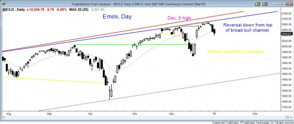
Daily S&P500 Emini candle chart: Broad bull channel
The daily Emini chart is reversing down from nested expanding triangles and a big wedge top at the top of the broad bull trend channel. However, it is at the moving average, and the rally in October was so strong that it might have at least one more new high, which could create a new wedge top.
The daily S&P500 Emini candle chart is reversing down from the top of the broad bull trend channel, but it is still making higher highs and lows and is therefore still in a bull trend.
If the Emini gaps down on Monday, there would be an island top trend reversal with the December 18 gap up. Significant reversals often come from island tops, but most island tops are followed by pullbacks and then new highs. The current sell-off might simply close the gap and then reverse up. The bears need much more follow-through selling, including a move below the October higher low, to make traders believe that the trend might have reversed down. The rally from the October low is so strong that the Emini might need a 3rd push up before it will have a correction of 10% or more.
Traders can see the end of the day bar-by-bar price action report by signing up for free at BrooksPriceAction.com. I talk about the detailed Emini price action real-time throughout the day in the BrooksPriceAction.com trading room, and a 2 day free trial is available.
When I mention time, it is USA Pacific Standard Time (the Emini day session opens at 6:30 am PST, and closes at 1:15 pm PST). You can read background information on the intraday market reports on the Intraday Market Update page.


